


PepsiCo’s Lay’s has become the latest in a series of household names that are redesigning their brand with a more modern edge.
Pepsico announced the “largest brand redesign in Lay’s nearly 100-year history” on Thursday on the heels of Domino’s revealing plans for its own rebranding attempt.
But Lay’s isn’t just updating the look of its products – it’s also ensuring they are made with cleaner ingredients, aligning with the administration’s health goals under its “Make America Healthy Again” initiative, as well as updating its packaging.
CONSERVATIVE ACTIVIST SLAMS CRACKER BARREL; COMPANY LEFT REELING AFTER LOGO REDESIGN
The company said all of its core Lay’s products in the U.S. will be made without artificial flavors or colors from artificial sources by the end of 2025. Additionally, Lay’s Baked will be made with olive oil and have 50% less fat than regular potato chips. A new version of Lay’s Kettle Cooked Reduced Fat Original Sea Salt will be made with avocado oil and offer 40% less fat than regular potato chips. The company said that more options across PepsiCo’s food portfolio will debut in 2026.
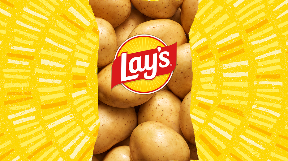
The company said the “new Lay’s visual identity,” which was created by PepsiCo’s design and innovation team, features a “warmer” and more distinct sun.
“Sun rays, or ‘Lay’s Rays,’ beam from the logo, a nod to the light that helps potatoes grow,” the company said. There is also a “refined color palette” that is based off the ingredients of Lay’s recipes, and close-up visuals that highlight the golden color, crisp texture and seasoning of each chip. Lay’s describes the new packaging as letting the “potato itself and rich farm imagery take center stage.”
CRACKER BARREL’S LOGO MEA CULPA IS A START BUT IT SHOULDN’T BE THE END
Laura Burkemper, business and brand strategist at Scaleblazer, called Lay’s rebrand “historic” as it’s the company’s first major overhaul in nearly 10 years, praising its effort in changing both the packaging and ingredients.
“It’s a masterclass in visual storytelling: billboarding their name, matte packaging, a custom typeface, and imagery that spotlights farm-grown potatoes and quality ingredients make the brand impossible to miss,” Burkemper told FOX Business.

By removing artificial flavors and colors, Burkemper said the company is also making a clear “commitment to cleaner, more transparent products, connecting with health-minded audiences while reinforcing authenticity in a crowded snack market.”
DOMINO’S REBRANDS FOR FIRST TIME IN OVER A DECADE
Even though “these changes address only a small piece of the broader challenge of the standard American diet, they position Lay’s as a brand that continues to innovate, inspire trust through transparency, and set the standard in snacking,” she said.
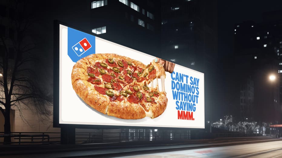
The move was announced just a day after Domino’s unveiled a strategy aimed at modernizing the brand’s signage, uniforms, packaging and music. Domino’s move was praised by some brand strategists and media relations specialists who said the pizza chain struck a good balance in refreshing its brand without alienating customers – a mistake they say was made by Cracker Barrel.
| Ticker | Security | Last | Change | Change % |
|---|---|---|---|---|
| DPZ | DOMINO’S PIZZA INC. | 413.50 | +2.07 | +0.50% |
| CBRL | CRACKER BARREL OLD COUNTRY STORE INC. | 41.96 | -0.63 | -1.48% |
Cracker Barrel is still facing fallout from its ill-fated effort to refresh its logo and restaurant interiors for a more modern look. The move triggered intense backlash, a steep drop in stock value and an eventual reversal.
Read the full article here


