


In my younger years, I was known for dressing in bold colors: Why go with a ho-hum neutral when I could stand out in fuchsia, red, or neon orange?
I still adore those shades. But now that I’m in middle age and often traveling for work and leisure, I gravitate toward wearing black for ease and practicality’s sake. After all, a suitcase full of black staples is guaranteed to match.
Surely, neither of these extremes was ideal for my lifestyle or complexion — not to mention my sense of personal style — and I was determined to figure out a better way to dress.
So, I made an appointment to get answers from a pro. While shopping at the Kildare Village outside Dublin, I met with senior stylist Sinéad Kelly, who is trained in color theory.
The 45-minute analysis, which costs 100 euros, shifted the way I think about choosing the clothes I wear.
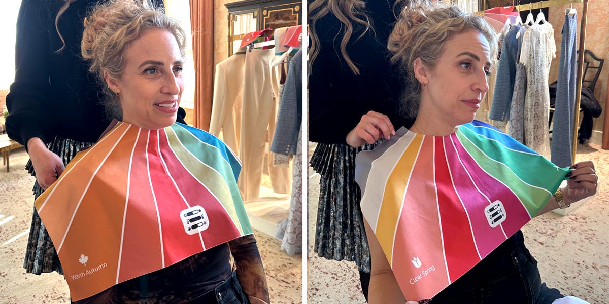
The analysis mostly focused on my undertones
At Kildare Village, Kelly’s team uses a method they call the “Perfect Palette” to help shoppers figure out which hues they might want to wear or shy away from.
“By determining your skin undertone, eye color, and hair color, we can ascertain what color suits best,” she said.
The method uses a system characterized by seasons and color temperature. For example, winter and summer lean cool. Spring and fall lean warm. From there, each palette has different categories in levels of brightness and intensity.
That said, analyzing your colors to see which shades could flatter you the most goes back decades. Methods vary from testing fabric swatches against one’s skin to sending photos of oneself wearing a range of colors to an expert.
In my case, Kelly used colorful pieces of fabric draped around my neck like a collar to test shades while evaluating my appearance: lighter skin with yellow undertones, blond hair, blue-green eyes.
From there, she determined my ideal palette as “soft autumn.”
So, colors I look best in include muted, earthy tones, like warm browns, olive greens, subtle peaches, and soft taupes.
My ideal palette had a few more vibrant tones, but none of the ultra-bright and dramatic colors I’ve always felt drawn to.
This revelation was staggering to me: Before my hyper-focus on practicality shifted my looks toward black on black, I’d always gravitated toward the kind of bright colors that, according to my analysis, are not great for me.
In fact, “bold, bright, cool colours” in general (yes, including my favorite fuchsia) aren’t recommended for me as “they are too strong and dominating” against my coloring, Kelly said.
“The colors are wearing you as opposed to you wearing the colors in a balanced and harmonious way,” she explained.
It turns out my travel-staple black clothing is a bit too harsh against my skin and doesn’t have a key place in my ideal palette, either.
My results gave me a lot to think about
All this matters because what you wear can change the way people perceive you at a glance.
“Color is the first thing people see, and the first thing they remember” about somebody, Kelly said. She said wearing your best colors can reflect positively on your facial features, brightening your skin tone, eye color, and hair color.
The right shades can make someone look energized, “waking up the face more than a cup of coffee ever will,” she added. In my mind, this advice also translates to “the right colors can make you look younger” — a reasonable goal for me as a middle-aged mom.
Conversely, based on this analysis, those fuchsias and brights I always connected with can make me look older, sallow, and well … just not my best.
I don’t need any help in that department, given my lifestyle includes a 6 a.m. daily wakeup routine and race to the school bus stop with two kids.
I plan to keep the results of this analysis in mind as I choose what to wear in the future
The color-analysis session gave me major food for thought.
When I’m collecting pieces for the capsule wardrobe I travel with and choosing my go-to outfits for events and meetings, I’ll now lean into the muted, earthy tones that rarely caught my eye before.
I like the idea that these hues can warm up and brighten up those all-black looks I’d defaulted to for ease. This goal feels doable and aspirational for me as I continue to build my closet.
Although my ideal color palette is muted and I’m now more hesitant to return to wearing super-bright shades, I want to stay true to myself and focus on fun when I dress for trips and other adventures.
For now, I plan to weave my power neutrals into my wardrobe in a fun way by leaning into animal prints, which I’ve always loved.
This analysis has given me an excuse to wear more of them — and, right after my appointment, I bought a new brown leopard-print top that fits my style and my palette.
Read the full article here


